

MICROSOFT AZURE PIE ON-CALL LOGO
Azure was in need of a logo for their Azure On-Call product. This product will be a tool to help engineers create on-call schedules, manage shifts within different timezones, and make substitutions.
This project contains content that cannot be disclosed and have been modified for this portfolio.

PROJECT
Logo for the new Azure On-Call product.
Background:
Azure On-Call is a privatization of IcM as a third party offering. It will be living in the Azure portal as a tool used for scheduling shifts of multiple teams in different time zones, as well as support substitutions, ongoing rotations, gaps and overlaps.
Goal:
To visually represent all offerings of the product while making a cohesive story with the colors of Azure.
Challenge:
The logo must be able to scale to small sizes in order to be part of the navigation of the Azure portal, and be able to stand alone as a brand identity of the product.
Logo must be accessible and meet color contrast ratios, and align with the Azure color palette.
Incorporate the new design developments and approach to the Azure brand, such as colors and use of gradients.
Communicate “schedule”, while differentiating from typical calendar/schedule logos by representing the Azure On-Call product features as well.
Make this logo be part of the family of products.

This design process was created by Azure PIE visual designer, Jacob. We followed this process as we worked together to develop a new approach for visual design on the Azure PIE team.
KEY WORDS
Rotation
Schedule
Substitution
Time
Shift
Global coverage
INSPIRATION

SKETCHES

After sketching, I met with a key stakeholder, the project manager of the Azure On-Call product, for feedback, as well as my manager, Raquel, and Azure PIE visual designer, Jacob. We decided to go with the directions that represent schedules because the main capability of the product is scheduling.
In addition, we decided to include the arrow to represent rotation. I included the circle behind the arrow to add a foreground and a background, which is cohesive with the Azure brand.
REFINEMENT - CONCEPT
After meeting with the project manager, Raquel and Jacob, I brainstormed 3 directions with focus on ability to scale to smaller sizes and emphasis on column detail.
The next step was adapting the logos to the grid system in partnership with the Azure visual team (grid system shown below), to meet the goals of scalability and cohesion with the Azure brand.


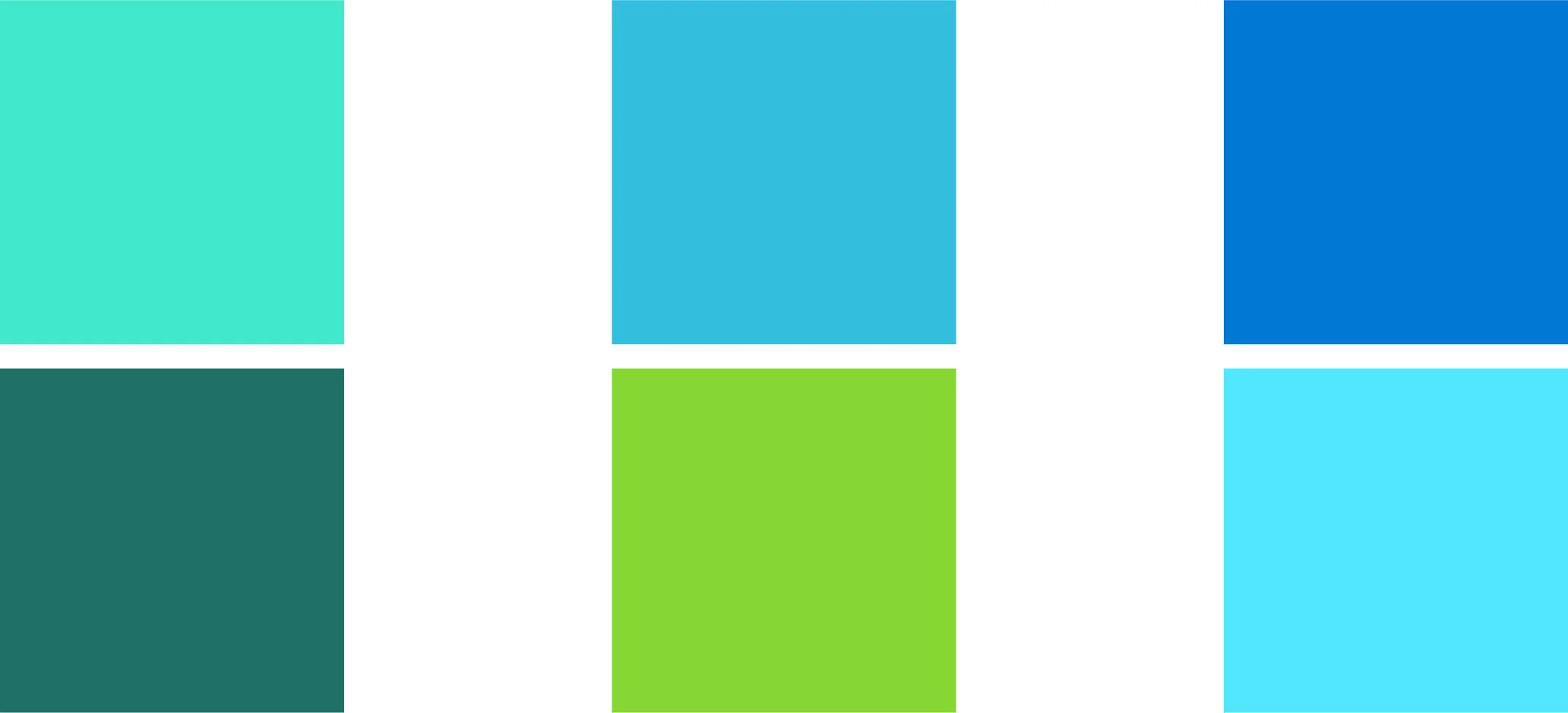
REFINEMENT - COLOR
Next, I explored various color combinations within the Azure brand. The Azure blue + teal combination (far right) met accessibility contrast and color ratios, in addition to being cohesive with the Azure brand, and was the chosen color palette for the logo.
REFINEMENT - DESIGN
I then presented in the design review for feedback. Once the project manager and I decided we were in a good spot, I decided to showcase my work in front of a larger audience, including UX designers, visual designers, UX researchers, and design managers. I received very valuable feedback that I applied to the next iterations.
Below are steps taken in the refinement process according to feedback I received from the team at each step.

FINAL DESIGN


Azure Icon Family
